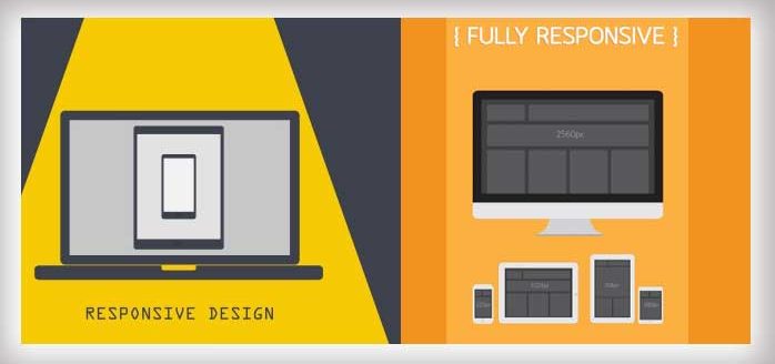
Responsive Web Design
Deprecated: class-oembed.php is deprecated since version 5.3.0! Use wp-includes/class-wp-oembed.php instead. in /home/zarcom/public_html/wp-includes/functions.php on line 5506
The last few years have seen a riotous change in the trends of internet usage and conventional website has been shaped to fully responsive web design. Unlike the past, internet has now dawned into new stations. Now the pool of Mobile and Tablet users contribute as one of the major part of the internet population. Desktop users are decreasing with every passing day and the number of users browsing the web through other mediums is skyrocketing.
The conventional display used in most websites is optimized for displays connected to desktop units. Conventional users usually have to browser in vertical and horizontal directions to scroll along the complete page, this issue is troubling for most users and a large percentage of the user base quits the web page due to the incorrect zoom ratio. Some websites also have to maintain separate servers and domains for their mobile website contributing enhanced costs compared to the desktop sites. But with Zartash’s Responsive Web Design Services, Users will no longer leave the website due to positional adjustments issues, Customers will increase a massive increase in their browser’s pool due to the enhanced customer experience that Zartash’s RWD (Responsive Web Design) brings.
” Our Responsive web design takes browsing to a whole new level by automatically aligning the resolution of the web page in accordance with the device used.”
The device is then able to adapt to the website in a matter of milliseconds. The optimization time is so minute that the average human reaction time cannot observe the website optimization. The Same adjustments can be acquired from Zartash for different Browsers that will allow the website to align in the appropriate position with every single browser.
Zartash employs the state of art technique of Liquid layout extension. This technique allows the fluid grids to act as an extending part of the liquid based layout that is initially created. Conventional websites are usually highly profligate when it comes to fluid gridding which causes multiple issues in Big to Small Screen conversions. Zartash’s technique makes the grid-ins a part of the whole webpage and hence both work in sync to produce a magical effect while using the same page of multiple devices.
One of the most important substantial features specifically of Zartash responsive web design is that the Styles used in the page are separated from the content that is to be inserted. This feature allows easy management of the website by content managers and even administrators without change in non relevant technical parts. Zartash primarily deals in such websites based on word press but it also allows services in Drupal if it is a specific customer requirement.
Zartash is a tested name in the field of responsive design, we offer to not only create new web pages using Responsive Web Design but we also convert established conventional websites into responsive websites. Our experts modify, recreate and redesign conventional website using latest tools which allows the user to experience multiple features including flexible grind-ins, multimedia queries as well as flexible sizing.
“Image courtesy of [2nix] / FreeDigitalPhotos.net”.